Penguin has been producing some beautifully designed book covers recently, but there is something we cant agree on here.
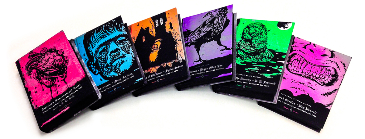
The Penguin Horror covers were unveiled a few weeks ago but they floated onto our Twitter feed this morning and its safe to say we love the illustrations.
Designed by Penguin Art Director Paul Buckley and curated by horror film master Guillermo Del Toro, the covers have a dark and creepy look but are bold and compelling at the same time, really bringing the books to life in a whole new way.
However, when it comes to the typography, we are in disagreement.
For some of us, the gothic type works perfectly with the screenprint-style iconography and helps reinforce the fact that these are classic horror novels.
For others, it is the complete opposite, conjuring up connotations of old and dull rather than modern and exciting.
Perfect accompaniment? Or overused cliche? If you feel like settling this debate, please to send us a tweet with your opinion!
You can buy all 6 books from the Penguin website.