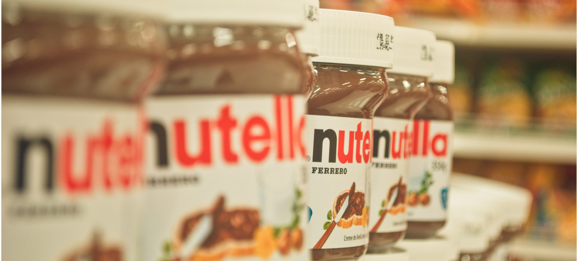
What would happen if you stripped back the ‘busy’ packaging of well-known brands?
Creative Bloq posted a few days ago about London-based designer Mehmet Gozetlik and his concept of taking well-known brands and reducing their packaging design to the bare minimal, ridding the likes of Nutella and Lindt of their ‘busy branding’.
Sometimes brands can overdo the typography, colours and graphics used on their packaging and this project opens up the question of whether or not minimal designs look better? Or worse?
We think it’s a very interesting idea, but have mixed views about the effectiveness of the designs.
For us, it opened up a lot of other questions:
Would these minimal designs be easy to pick out on shelves when they are stacked next to their competitors?
Will it still be easy to differentiate between different flavours, particularly with the Lindt design?
If customers aren’t familiar with a brand, and the pictures of the food inside the packaging are removed, will they choose another brand that does picture the food?
If you simply strip back the branding, do you run the risk of making the product look lower quality?
Definitely food for thought (no pun intended). The key thing is that Gozetlik’s project succeeded in provoking conversation and we spent a good while considering the pros and cons of minimal branding.
For the record, we like the Schweppes and Nutella designs the best.
Image credit: PG.NETO
