Too often we find that explanations for identity designs are overly complicated or justified with post-rationalisation.
This is why we want to quickly mention Nalla Design’s rebrand of Independent Midwives UK as an example of good design.
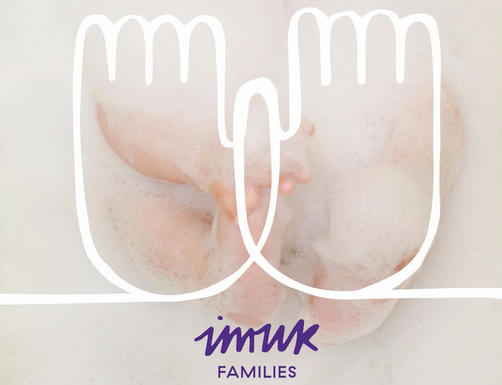
The main graphic element in particular is good because it is simple, easily transformable and the reasoning behind it just makes sense.
Nalla’s lead designer Alice Saunders said: “Many midwives refer to their job as baby catching, so the use of a hand seemed fitting.”
We also like the single-line style, used to represent the midwives continued support from birth to post natal.
If we could only give out one piece of advice, it would be to keep your designs clear and honest.
Also, use cute babies wherever possible.
It might be #BlueMonday but we’re feeling more purple after the launch of the new @IMUKMidwifery brand and site pic.twitter.com/1quiOjO5UK
— Nalla (@Nalla_Design) January 19, 2015