Good design begins with good research. When designing a UI, it is vital to understand the potential users and the development constraints.
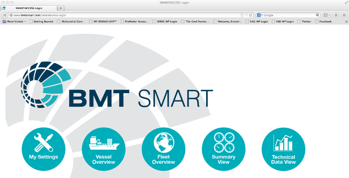
We recently created an updated UI design for BMT’s Smart Access programme, which perfectly demonstrates just how complex it is to design an interface that works for people with different levels of technical skill and requirements.
BMT is one of the industry leaders in the measurement of vessel performance and their Smart Access programme was devised as a comprehensive tool for monitoring the status of ships. However, the highly technical nature and complexity of both the data and the interface meant that it was only really useful to engineers and naval architects.
The interface was originally developed as part of a complete system installed into client ships that included sensors and on-board hardware, sold as a one-off package to both ship owners and charterers.
But BMT decided that there was a potentially bigger revenue stream available if Smart Access could also be presented as a management tool sold via a user subscription.
The problem they faced was that the complex and technical nature of the original interface would not be suitable for a managerial audience, so they engaged us to advise on the development of a new, more accessible interface. It would retain the technical information for engineers and architects but also provide managers with a quick overview of their vessels, outlining whether or not they were performing to expectation.
The first two stages of our design process are to listen and understand and that is exactly what we did.
“Knowing and understanding the profile of the new users of the interface was a vital element of the preliminary design process,” says FdK’s Simon de Kretser.
“While in consultation with BMT, we built ‘avatars’ of the typical management and technical users who were both ship owners and charterers, including analysis of their expected time using the programme and the devices they would be using.”
With the UI needing to be complex yet accessible, it was essential to do this work before we could put pencil to paper. It informed any design that we did and gave us key benchmarks and metrics to measure proposals against.
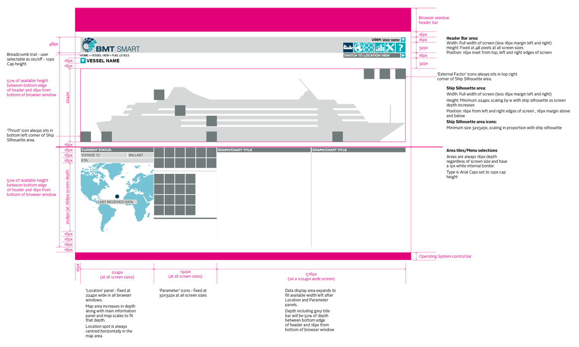
The most challenging part of the project was designing a framework that allows individuals to create a personalised dashboard of the information they need – at a glance – and then allows the data to be ‘drilled into’ in increasing steps of complexity. This necessitates a complex underlying grid and a wide set of tools, iconography and data presentation styles that remain consistent and reflect the BMT brand at all points.
But that framework design also needs to be realistic and at this point we should discuss the ‘development constraints’ mentioned at the beginning of this post.
While understanding the profile of your users is important, it is also important to understand the limits of the platform you are designing for. So it is essential to bring together the designers and programmers at an early stage in your project to ensure a synergy between the designers vision and the constraints of the technology.
“An early sharing of concepts and ideas also helps to create a better sense of ‘team’ and ensures that both can work together effectively to deliver what the client needs,” explains Simon.
For anyone looking to build a UI, Simon provides 4 key points to take away:
– Don’t stint on the preliminary research into user profiles and the ‘human factors’ (the ergonomics of the way that people interact with data on a computer screen).
– Ensure that designers and developers are aligned in their understanding of the objectives and ultimate outcome of the project, looking to stretch boundaries but not attempting to deliver the impossible.
– Remember that clarity and usability are king.
– Detail is everything in this kind of design (see above image) – you will need every aspect worked out down to the last pixel to ensure a satisfactory outcome!